
Digital comic artist & illustrator.


Over & Under:
the making of the Graphic Novel
“Over & Under”,
Self Published
Illustrator, Writer, Letterer, Storyboarder, Character Designer, Inker, Colorist

“Over & Under” is a self published, both online and in physical form, queer office-romance graphic novel written, storyboarded, paneled, inked, colored, and lettered entirely by myself using Medibang Paint. This project, serving as a Vol 1 for “Over & Under”, sets sights on 29 year-old Amir Sanchez, a glum, and stoic looking designer who moved into the busier side of the city to seek some independence. Amir is removed from his peers at his workplace, and has a certain way of going about his projects-- which makes asking for any help with his most recent one: tricky. Vivian, the manager of his department suggests he search for help from his across-the-door neighbor slash co-worker: Mike, who’s already tried to strike a friendship with him at the office. She thinks it’ll do him good seeing as Mike is Amir’s polar opposite. Amir is initially opposed to the idea, though finally working beside Mike one late night and doing more talking than he’s used to-- Amir finds that he might not mind the guy’s presence after all.
"Over & Under" from its conception, was meant to be a digitally illustrated graphic novel that would be utilizing already existing original characters of mine. It would remain in black and white, and have a physical mock copy by the end of Spring 2025, and alternatively, its own webpage to host it. It explores themes of queerness, self isolation, and the importance of being open minded with the opportunities around us. My official set goals as an artist for this project were: executing my story in a way that engages the reader with my writing and artwork, distinguishing my series from other existent works in the market, balancing my artistic vision with production deadlines I’d set for myself, and maintaining consistent artwork and other graphic novel visual elements (lettering, speech bubbles, paneling, etc). Too, will aid in building rapport with potential publishers that will view my graphic novel in my portfolio.
My intentions
Considering this is my first stint with a project of this size, and a graphic novel all together, my first steps were to reference the people who had done it before me. This includes but isn’t limited to the works of Bryan Lee O'Malley, Nygozi Ukazu, and ND Stevenson, authors of Scott Pilgrim, Check, Please!, and Nimona: respectively. Bryan who specializes in paneling, lettering and graphic novelization, and Nygozi, someone who specializes in cartooning, illustration and graphic novels. Bryan’s less refined artwork in his early projects, use of screentones, and ability to tell his story so masterfully through his dialogue were of particular interest to me because they were things I told myself I’d like to consider, and implement in my own work. My art style used for “Over & Under” also very much took from Nygozi and Bryan alike, especially in their influences from manga, and internet culture. As well as my own love of comics and manga from childhood onward (i.e: Archie Comics, The Walking Dead, the works of Raina Telgemeier, Skip and Loafer). A very mixed bag, but giving me a variety of things to pluck away and insert into my own style like their loose inkwork, simplification of backgrounds, and exaggerated shape language in characters.
Inspirations to Lay Groundwork


Image credits: Bryan Lee O'Malley, Scott Pilgrim Vol 6, Check, Please!! Books 1 & 2
Character Work
What came next were the key components to my graphic novel’s visual success: the characters involved. This meant their designs, and what made for a good one. I began with my turn-arounds, taking what I practiced during my character design work and translated their personalities better through their design, but made them distinct enough so that they were recognizable in their own story. I made sure there was a visual contrast between Amir and Mike too, even with them having mundane office jobs. One method of note being the grayscale test of flipping the colors on their reference sheets, into the greyscale that would be utilized in the actual graphic novel, and see if they don’t blend too much with another on the character. This was done on Medibang Paint, and Vivan’s turn-around would also be done alongside them, and would all be used for what would become the storyboards.


Amir, Vivian, Mike (in-order) concepts, turn around (2024, Spring)

Amir, Vivian, Mike (in-order) final references (2024, Spring)
Storyboards
Since graphic novels don’t abide by a traditional storyboard, as would animations, I made what’s more of a progression sheet of events that would later be paneled out, and expanded on. I drafted 20+ pages worth of storyboard squares that would lay out the wiring for the scripting process.


2 pages out of 22 storyboard pages done for
"Over & Under" (2024, Spring)
Scripting
The scripting process was probably the briefest portion of this project, and went through the bigger changes because of the storyboard. It was more of a spur of the moment thing, and when looking at the visual cues I’d given my characters in the storyboards, I’d sat down and drafted the dialogue between the characters all in one sitting: trying my best to make whatever tension and awkwardness there was between Amir and Mike, translate to the audience too.

Excerpt of "Over & Under" script (2024, Spring).
Oftentimes, in a more comedic way that didn’t take away from the more serious themes, and was well timed. The tone I’d wanted to set was lighthearted because of how queerness in stories should come with the normalcy we grant heterosexual romances in fiction, but one of self-exploration with two men, into each other romantically to varying degrees, and buzzing with their own insecurities on top of that, which doesn’t make it easy to click. The authors I’d mentioned before very skillfully master things like that with how short, long, and well-timed their dialogue is in every one of their stories. And, more importantly, the dialogue means something to the progression of their narratives.
Paneling
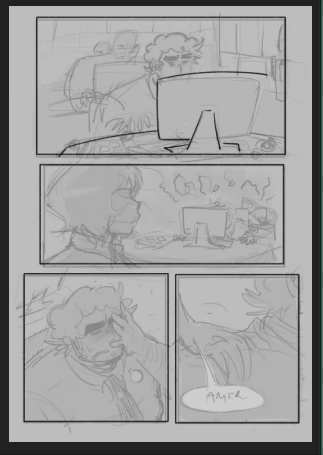
With the foundations of my project nailed down through my character sheets, script, and storyboard, I moved into one of the more intensive portions of my project: paneling. “Over & Under”, I wanted to have a pacing that fit the story, and made it so the characters were introduced and given a general run-down on. This was so that during the further parts of the story: there had been enough information divulged for the audience not to be confused, or for the conclusion (open-ended as it was,) to feel hamfisted.


Visual elements integral to graphic noveling such as paneling, make or break that goal of mine if not done in a certain way. Which is why my paneling was less formulaic and oftentimes had the illustrations bleed out of the panels. This, as well as the onomatopoeia, which added a feeling of interaction between the sounds, and the characters sharing the same panels as them. Although I did break a few rules with the paneling, I also stayed true to things such as key moments in my story being expressed through my panels alone. If I needed a moment between Amir, Mike, or Vivan to feel longer, shorter, significant, or less significant on purpose: I’d execute that in panel size and quantity.
Early paneling for "Over & Under" pages 1 & 2 (2024, Spring).

Timelapse for paneling, "Over & Under" (2024, Fall).
Digital Inking
After a summer long’s while of doing just this, the inking– or digital inking process was next. This was one of the things I was much more lax on, and allowed my lines to spill out into each other and feel unpolished. I wanted there to be a roughness to my linework, and for the sketchiness. This being said, I also didn’t want my illustrations on the page to feel sloppy, and lacking care entirely. A stylistic choice to use a lax hand during linework does not mean that you do not clean-up what needs to be cleaned up. I chose to do this mostly because a vector based digital inking style isn’t something I saw for this project during the development stages.
Digital Inking timelapse for "Over & Under"
(2024, Fall).

Digital Inking, page 49 for "Over & Under"
(2024, Fall).
Coloring
The coloring process, which was done in greyscale, was probably the most fun I had during the making of “Over & Under”, and a larger task than I expected it to be. Although I tried using the fill tools on Medibang to cut my time in half since there were already 70+ pages planned with varying degrees of tones, I decided to bite the bullet and do it all manually with a default brush, and instead divided my workload into coloring the pages with less emphasis on the backgrounds first.

Coloring timelapse for "Over & Under"
(2024, Fall).
The backgrounds themselves were done in a lineless, and painterly fashion that distinguished themselves from the foreground characters and objects. Some of them also vary in cleanliness depending on how much is going on in the foregrounds. I chose to do this as to not take away from the action and dialogue on each page, and also to make sure the characters and backgrounds didn’t fuse into each other.

Coloring for "Over & Under"
(2024, Fall).
Lettering & Dialogue Boxes
Dialogue boxes, and lettering was an entirely foreign concept to me since I hadn’t really read up on it besides its utility in conveying dialogue between characters, inner monologues, thoughts, and things like onomatopoeia. I’d used it before in previous comics I’d done off the cuff, but wasn’t so sure how to get the look I’d seen in previous graphic novels that served as style reference for me. I landed on using freehand dialogue boxes for the first couple of pages, which admittedly didn’t capture exactly what I was looking for clarity wise.

Settings for CC WILDWORDS font usage
(2024, Fall).
But, around the thirty page progress mark, I’d gone ahead and used the circle tools available to me, which made things look much more in line with what I wanted. The side by side is very glaring, and is something I now implement in my current comics. I’d also limited myself to choosing a text size on both ends of the spectrum, the smallest and the largest that would still be legible on the pages: all in the font of CC WILDWORDS, which is a font often used by manga artists since it looks simultaneously felty, but readable. The text sizes were between 4.5px and 11.5px.
Aesthetics
The textures and overlays I used on my artwork to give the pages the look of paper, and grit were a mix of the available sandpaper options on Medibang Paint’s open library, and from the free to use paper overlays from vecteezy. I had been using these with my personal artwork for some months at the time, and it had become a staple in my style and how I’d wanted it to look from afar, and up close. Paper overlays in context to “Over & Under” fit entirely into the office setting of the story, and is one of the stylistic choices I’d made from the get-go. I have seen a few graphic novelists using textures like these on entire pages of their work, but I can only compare it loosely to the screentones that manga and western comic artists use for serialized projects. Something which I also did when I hadn’t drawn backgrounds and instead used a Medibang Paint open library screentone, with added gradients.
Publishing
Digital & Physical
With the wrap up of actually creating “Over & Under”s substance, which was the graphic novel itself, there came how I’d be presenting the graphic novel both on a digital format, and a physical release.
Digital Publishing
“Over & Under”’s website was constructed through a web template specifically for webcomics, called Rarebit. Ripped straight from their Neocities hosted site, which is a platform that acts as a host for websites without needing to purchase a domain, “Rarebit is an HTML Webcomic Template written in simple and extensively commented code that even an HTML/JS beginner can figure it out, but modular enough that an HTML/JS pro can make it special. Everything is done in HTML and vanilla JavaScript, you don't need Bootstrap or JQuery or anything.” So, with this, I did have to learn beginner level HTML and CSS coding, but just enough to change around the navigation, attached images, and fonts. The site hosts a working archiving system for all the current pages, an about the author section, links to my socials, a link to my portfolio, and of course: “Over & Under” as the centerpiece, able to navigate from its starting point, to its end. A digital release increases accessibility by allowing the graphic novel to be easily distributed to anyone with a device. No matter where you are, you can read “Over & Under” on the website hosting it, the character profiles, an about the author section, and something linking back to how it was made.
Webview tour for "Over & Under" host site
(2025, Spring).
Physical Publishing
The existing “Over & Under” physical copies are of a hardcover and a paperback version. These were all sent to me using the printing service Mixam. Mixam offered me a wide range of customization for my graphic novel, including paper types, cover finishes, and binding styles. It also came at a sound cost that didn’t put a hole in my pockets. A physical release, which isn’t entirely necessary but still has utility for a graphic novelist with strong online presence, serves as a tangible piece of art that can be displayed or shared with others. Which makes it compatible for people who enjoy the sensory experience.
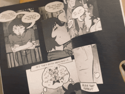
"Over & Under" paperback flip through
(2025, Spring).

